Strategic Launch: Bold Resolve, for A Healthier World
The Vision
UHN’s 2024–2029 Strategic Plan, “Bold Resolve, for A Healthier World,” represents a defining moment in the organization’s history. This is not merely a roadmap; it is a declaration of intent from Canada’s leading health sciences network. To signal this new era, we developed a high-impact digital platform that serves as the primary vessel for UHN’s forward-looking strategy. By merging editorial-style photography with a bold, minimalist aesthetic, the virtual report creates an immersive experience that reflects UHN’s commitment to making a transformative, global impact on the future of medicine.
The Ask: A Parallel Strategic Launch
This project served as the inaugural "live" application of the new UHN brand identity, requiring us to synchronize the organization’s highest-level priorities with a modernized visual language. The document had to do more than communicate goals; it had to function as a proof-of-concept, demonstrating how a bold, unified brand reinforces UHN’s position as a global leader in health innovation.
Exploration: A Unified Tripartite Mission
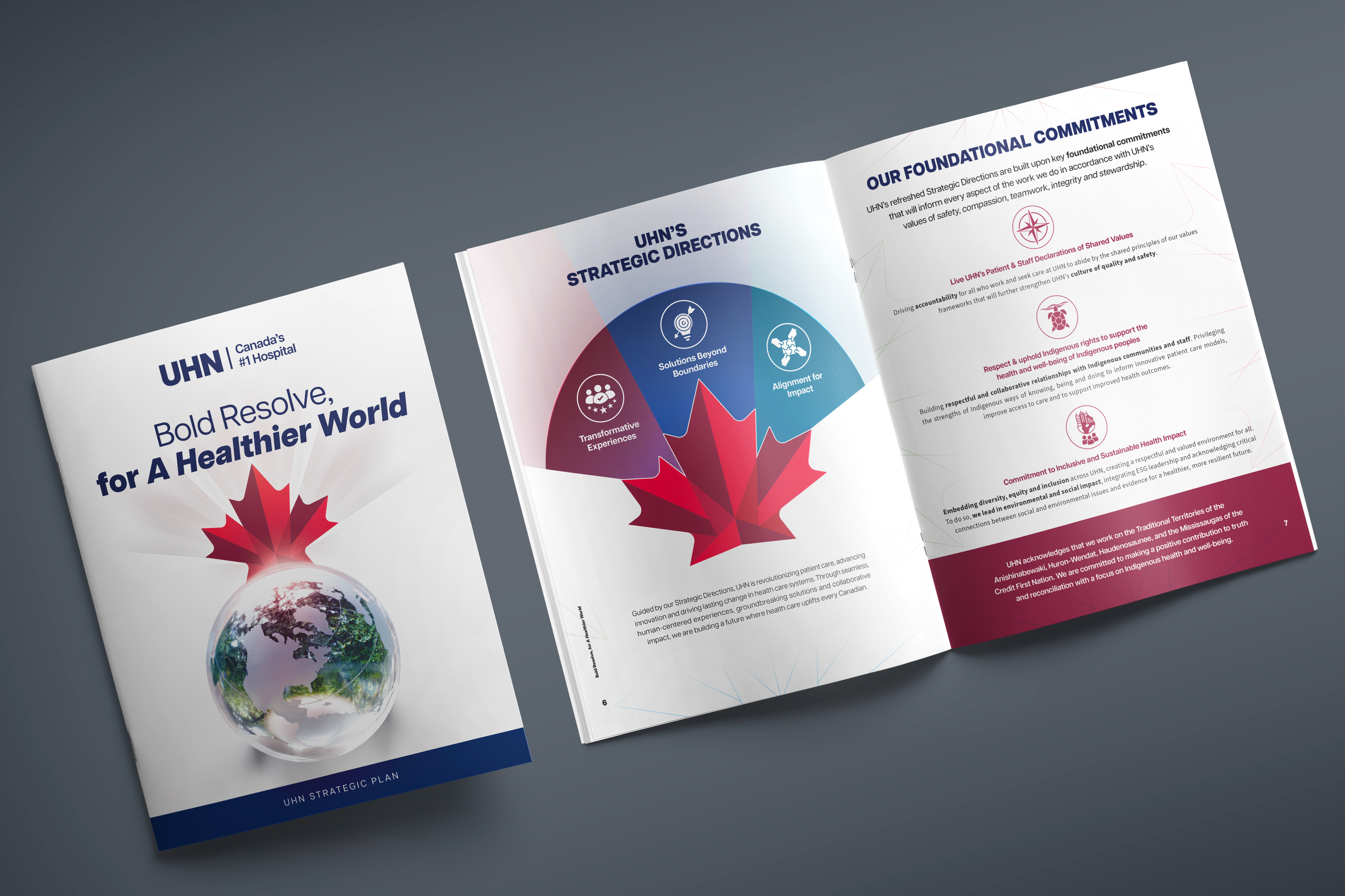
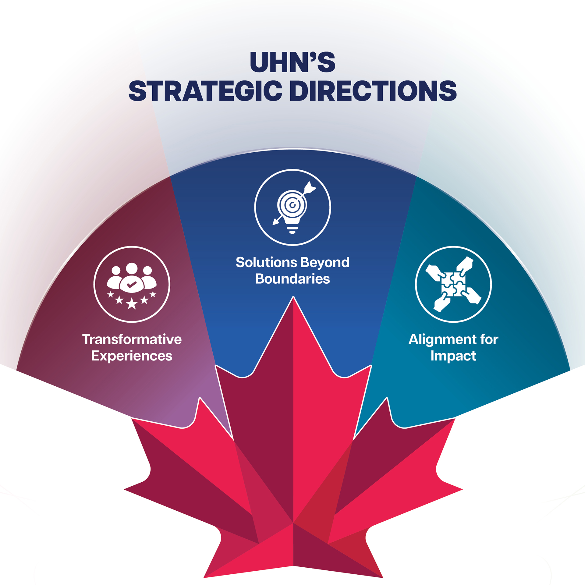
At the center of this dual launch was the transformation of the new UHN maple leaf icon into a functional strategic tool. We deconstructed the leaf to create a visual metaphor for UHN’s Tripartite Mission—the seamless integration of care, research, and education. Through a collaborative, iterative process, we engineered a signature graphic where the leaf is divided into three interconnected sections. This design reinforces the reality that at UHN, these three pillars do not exist in isolation; they are a singular, unified force. Whether in clinical care, groundbreaking research, or world-class education, the icon symbolizes a collective momentum. We refined this iconography into a versatile toolkit, ensuring the "Bold Resolve" identity maintains its gravitas and clarity across all applications—from motion graphics and digital platforms to large-scale environmental installations.
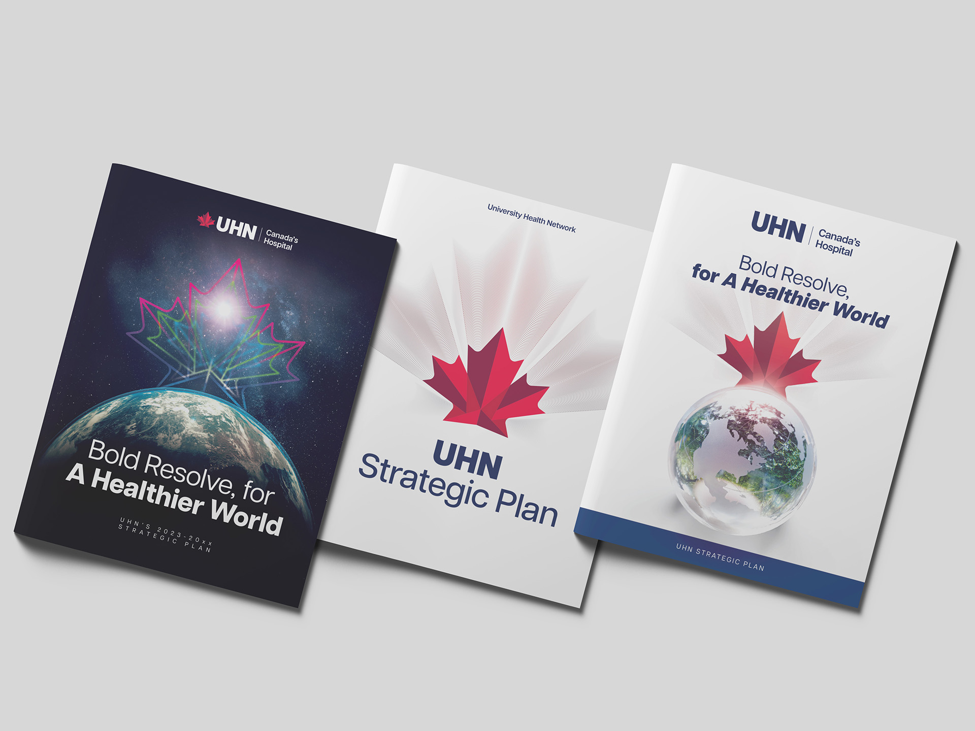
For the cover of the Strategic Plan, we created multiple versions of the maple leaf interacting with a globe, to symbolize UHN being Canada’s Hospital. In the finished result, the red leaf icon sits atop a marble-glass Earth, with North America clearly shown, and a green-blue accent colour and texture on the ocean. This encapsulates the messaging of the overall strategic plan and was also animated so it could be used online in a variety of formats going forward.
Deliverables & Impact
This 16-page booklet outlines UHN's foundational commitments, strategic directions, and key enablers. Through its distinct, modern, and authoritative look, it reinforced UHN's position as a world-class academic hospital, clearly articulated UHN's three pillars, and communicated UHN's ambition and plan to create a healthier world. The clean look and visuals present complex information in an easy-to-understand, visually appealing way, making it accessible to everyone from high-level internal staff to the general public.