University Health Network Brand Refresh
Overview
When the University Health Network undertook its 2025 brand refresh, the goal was clear: create a visual identity equal to the scale and ambition of Canada’s leading academic health sciences centre and one that would be recognizable as quintessentially Canadian on a global stage.
Working closely with UHN’s Communications and Brand Strategy team, KITE Studio helped translate that ambition into a bold, modern visual system—one designed to reflect UHN’s role as Canada’s Hospital: a place where clinical care, research, and education converge to advance health for the country and the world.
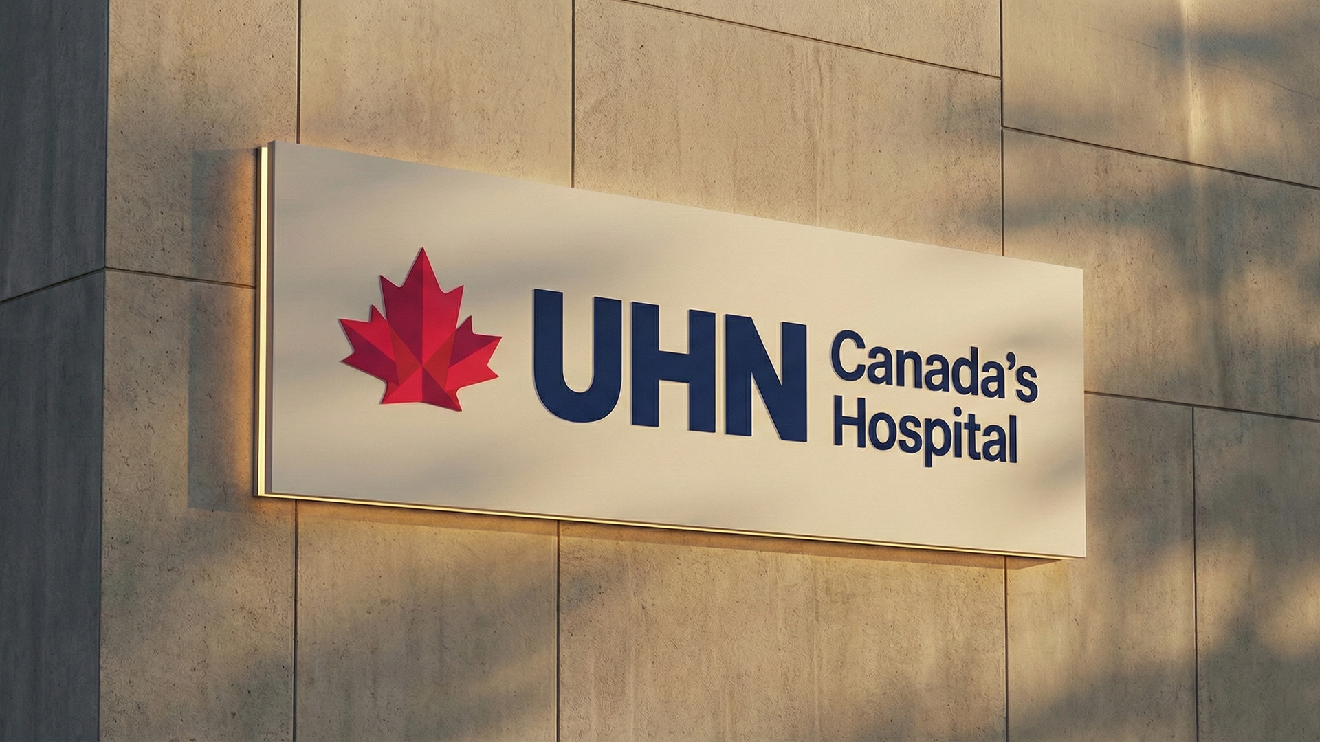
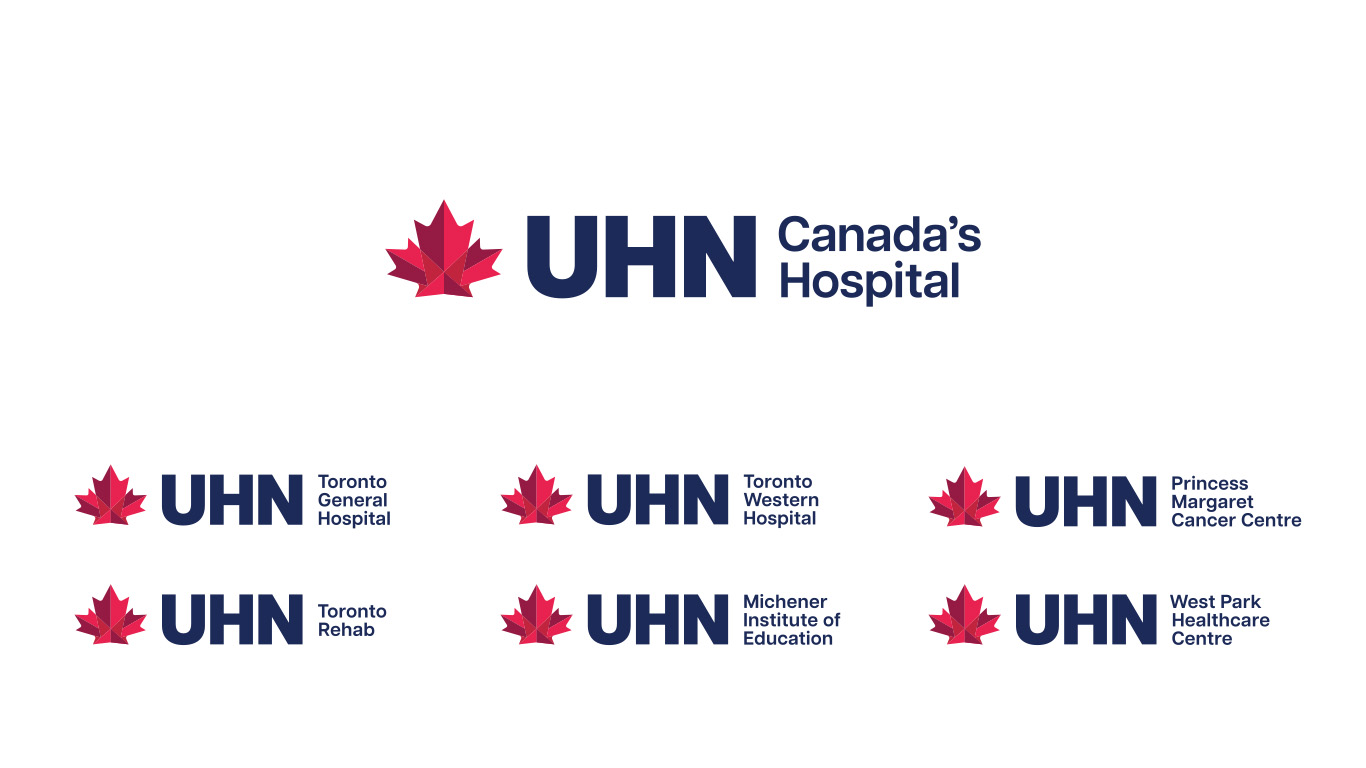
At the centre of the new identity is a stylized maple leaf. The mark is simple, confident, and unmistakably Canadian signaling both UHN’s national role and its global reach. Designed for clarity and flexibility, the logo functions across UHN’s campuses, research institutes, and programs, creating a single visual language that connects care, discovery, and learning across the network.
The refreshed brand was implemented through a comprehensive design system that included updated logos, colour palettes, typography, graphic devices, iconography, photography guidelines, and layout standards. To support consistent adoption at scale, the rollout also included practical tools such as branded PowerPoint templates, email signatures, business cards, and digital assets—ensuring seamless use across more than 20 programs, 6 institutes, and 10 locations and tens of thousands of TeamUHN staff.
The Ask
UHN sought a visual identity that was optimistic, contemporary, and scalable, a brand that could unify a complex academic health network while remaining flexible enough to support its many specialized programs and sites.
The objective was not only aesthetic consistency, but strategic clarity: a recognizable identity that would strengthen public awareness of UHN locally, nationally and globally, reinforce trust and Canadian excellence with patients and partners, and support the organization’s ability to attract global talent, advance discovery, and inspire philanthropic investment.
The renewed brand architecture needed to work seamlessly across the enterprise while clearly representing the institution’s three interconnected missions: clinical care, research, and education.
Exploration
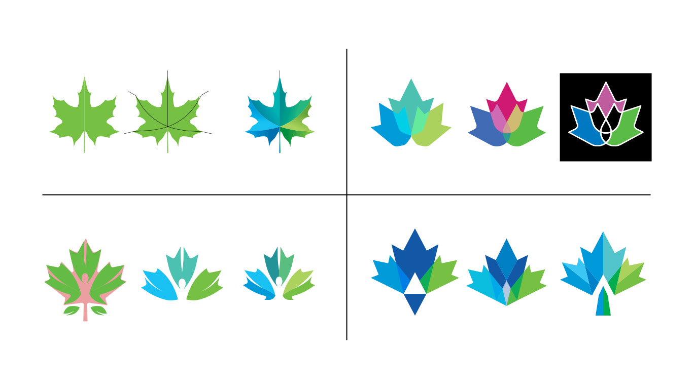
Idea Proposal
The renewed brand architecture and visual identity were built upon UHN’s status as Canada’s Hospital. A Canadian icon, the maple leaf, was chosen to replace the three laurel leaves, which had been in use for the past two decades. KITE Studio proposed multiple variations, with an easily recognizable, modern look winning out. The icon has a multi-panel look and uses three shades of red to add dimension and contrast, encompassing the three interwoven parts of UHN. That brand messaging was reinforced by the choice of Articulat CF, a modern, mid-century-inspired typeface that complements the icon's clean, sharp lines while evoking a forward-looking sense of progress.
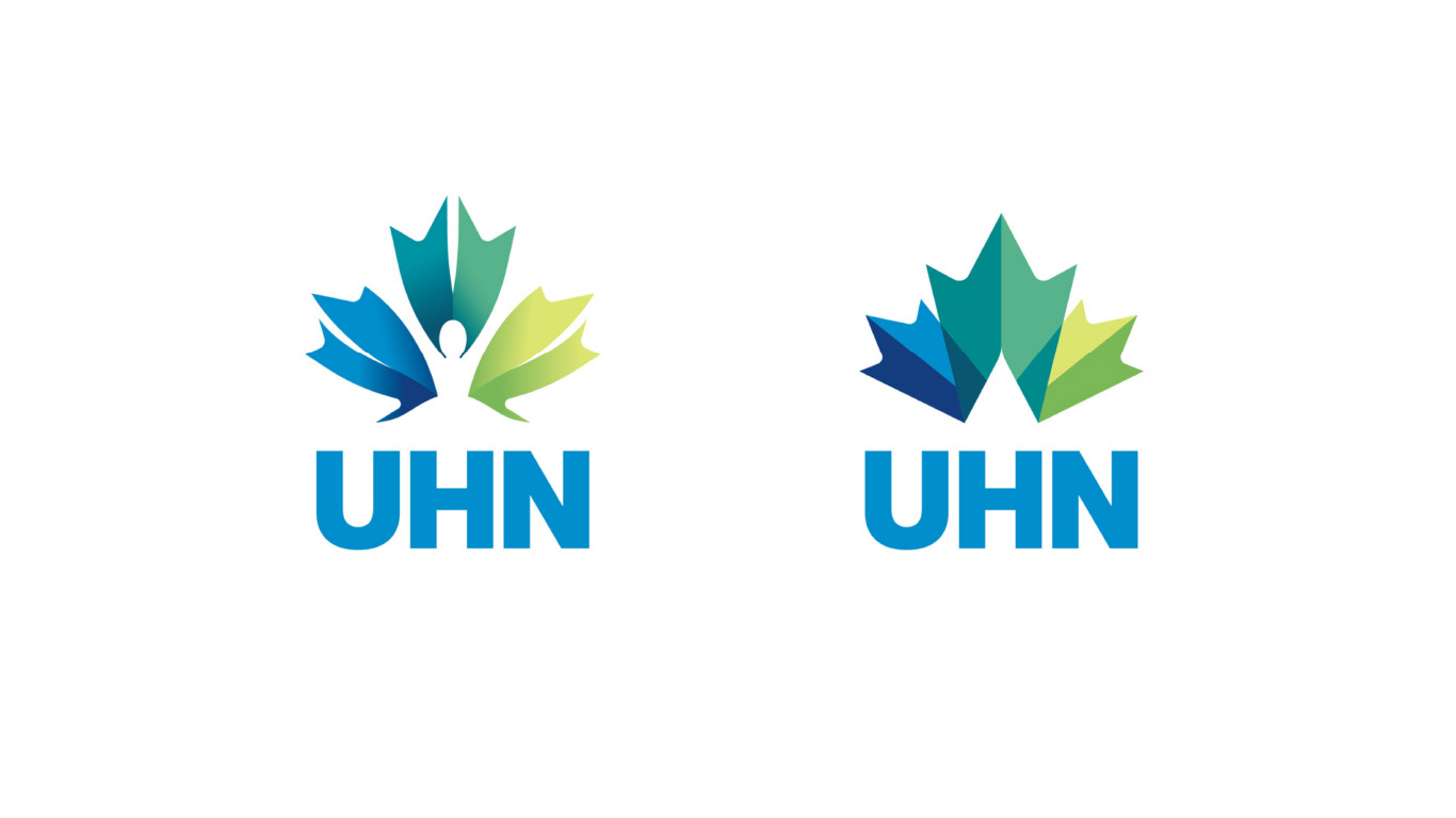
With a chosen foundation, we further refined the concept and tested its applications in preparation for testing and brand architecture setup. They were complemented by colour schemes that included variants of royal and cobalt blues, purples, and greens, a nod to UHN's past and to the integration of the West Park Healthcare Centre.
Deliverables & Impact
The UHN team and KITE Studio worked together to expand the brand, adding brand guidelines, graphical elements, iconography, gradients, variations, and subbrand logos.
Together, the new UHN identity makes more than a logo. It is a visual representation of UHN's crucial work transforming health care in Canada and around the world.
"This [new brand] reflects the full scope of who we are and what we do," says Kyla Kumar, UHN's Vice President of Communications and Brand Strategy. "It's world-class care, groundbreaking research and the education of tomorrow's health leaders, all working together, seamlessly, under one name: UHN.”